14 Jun Lake Placid Develops New Visual Identity Program
Rollout of branded materials to begin this summer; new website anticipated in early fall
The Regional Office of Sustainable Tourism has developed a new visual identity for Lake Placid. The newly developed logo and associated brand guide were unveiled at a Business After Hours event on June 10.
Updated visual identity elements include a suite of materials, including the logo, wordmark, color palette, typography, overall visual style, and photographic imagery; it also features updates to the Lake Placid brand statement, which guides various communication initiatives and associated messaging.
Lake Placid’s updated visual identity program is based on data from a comprehensive survey of more than 1,700 residents, business owners, area organizations and visitors conducted in 2023. ROOST also established a committee of community stakeholders to provide insight and feedback throughout the planning and design process.
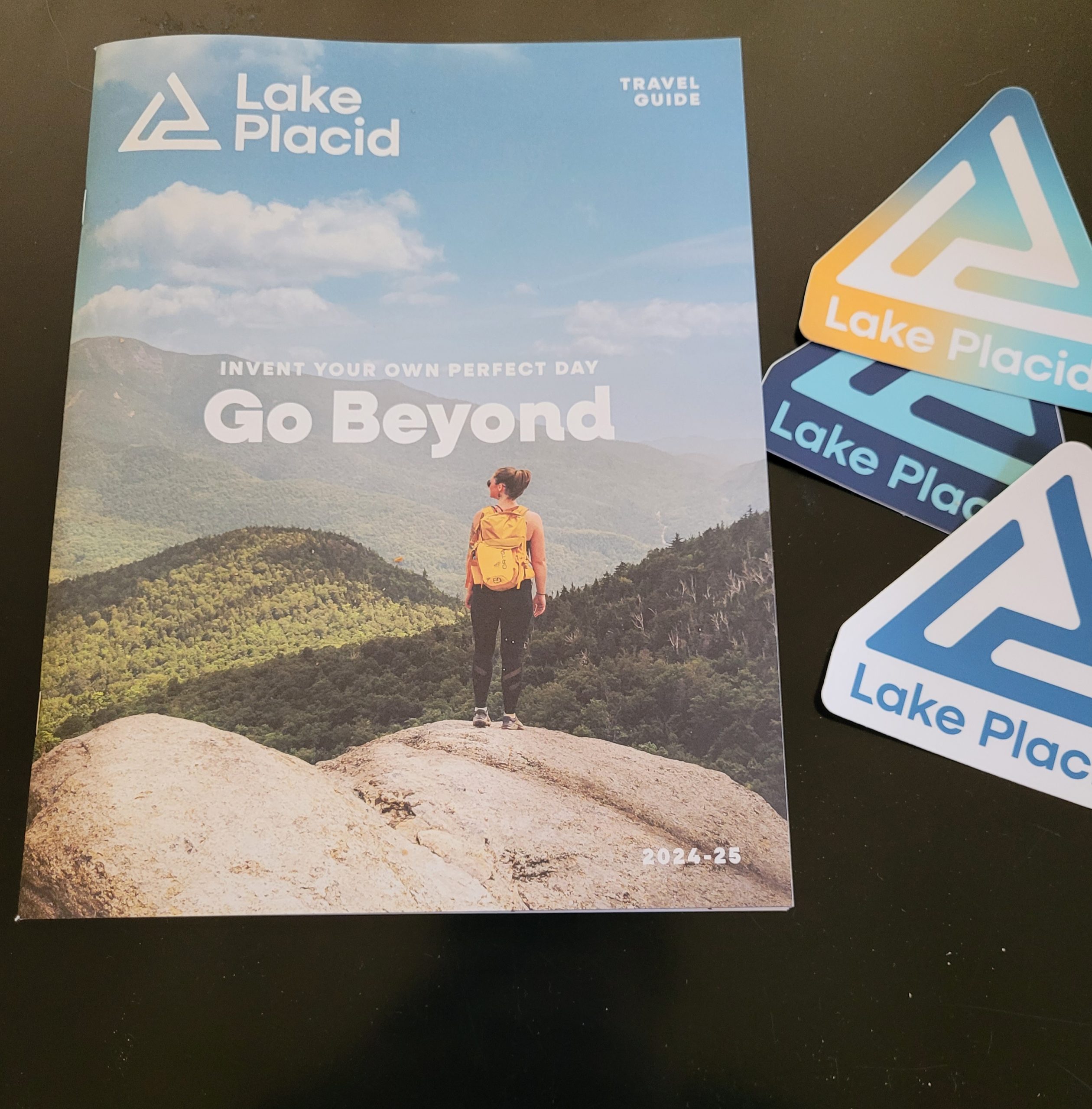
The new Lake Placid logo features a monogram depicting the letters “L” and “P” in a modern, stylized fashion. The “Lake Placid” wordmark has also been updated; these two elements are intended to be used together as a logo/wordmark combination, or each can stand on its own, depending on the intended use. The new logo and wordmark also allow for a variation that incorporates “New York” to further establish the village’s specific location – something that may be particularly important when marketing the region to new visitors along with national and international markets.
According to ROOST Graphic Designer Leigh Campbell, the logo’s shape provides a nod to both the landscape and the numerous activities available in Lake Placid. “The forward-slanting shape of the ‘L’ and ‘P’ suggest movement and action, while alluding to many Adirondack activities,” he said. “Some people see a mountain peak while others may see a tent, chairlift, ice skate or ski trail. We worked to develop a visual identity that truly embodies the essence of Lake Placid, both its landscape and the myriad activities it offers. The logo takes on various forms, inviting each person to interpret it in their own way. It’s a symbol that belongs to the community, capable of reflecting the unique passions individuals hold for Lake Placid. Just like people can invent their own perfect day in Lake Placid, they can develop their own interpretation of the logo, based on what means the most to them.”
The Lake Placid website has been updated to include the new color palette and logo. ROOST also developed a new four-season visitor’s guide that incorporates the new visual identity elements. There are new collateral pieces available for businesses and visitors, including stickers, window clings and tabletop signs for local businesses. Application of the new visual identity program throughout the community will take place over time, as materials are reprinted, updated and developed.
The brand statement was reviewed and refreshed to reflect new developments in travel and community trends, local cultural events, Olympic history, outdoor adventure, and Lake Placid’s reputation for welcoming all visitors who take advantage of many different types of activities. The “Invent your perfect day” tagline remains unchanged, as research indicates that visitors and residents felt strongly about its sentiment and relationship to the destination.
According to ROOST Marketing Manager Michelle Clement, the survey offered information that guided the process. “The survey confirmed our instincts that Lake Placid’s visual identity was due to be updated and that its appearance should be aligned with Lake Placid’s position as a world-class destination,” she said. “With that clarity, we formed a community-based brand committee that played a crucial role in shaping and guiding the updated brand statement, logo design and color choices. Both the survey and committee feedback aligned, revealing a strong desire for a brand that is clean, bold, elegant and timeless.”
According to Eileen Mowrey, ROOST Lake Placid regional manager, Lake Placid’s prominence as a popular location within the Adirondack Park, its position as a comfortable location with proximity to wilderness and outdoor activities, along with its refined style as a world-class visitor location were all considered during the rebranding process. “The new logo is clean and modern, reflecting the type of experience visitors can expect,” she said. “The color palette, while still bold, is slightly muted compared to the previous colors, offering a more natural and earthy feel with red, gold and various blue hues.”
Community organizations and businesses are encouraged to include the new logo and visual identity as part of their marketing materials when developing items that promote their business to visitors and local community residents. While the new logo was designed to be unique to Lake Placid, its clean and simple style will complement other logos on co-branded materials or events.
The Lake Placid brand files and a complete description of the brand concept and guidelines, including approved usage of the brand elements, are outlined in an online guide that is available for reference; details can be found at www.LakePlacid.com/Brand.
The Regional Office of Sustainable Tourism is the destination marketing and management organization for Essex and Hamilton counties, along with the communities of Lake Placid, Saranac Lake and Tupper Lake, all located within the Adirondacks of New York state.
No Comments